
At a glance
- Two layouts: a sleek single-column layout or an expanded two-column layout with a sidebar and widgets
- The two-column layout features trending posts, sections, a cover image, and gamification progress
- Sections group Spaces by theme — and can be organized using drag and drop
A community with 3 spaces needs a different structure than one with 15. Until now, there wasn't really a choice. Now there is.
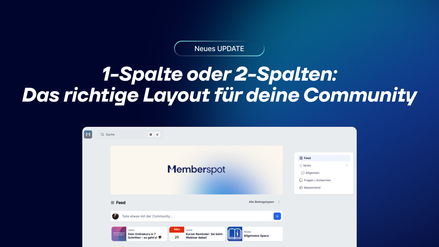
1-column or 2-column—which one is right for you?
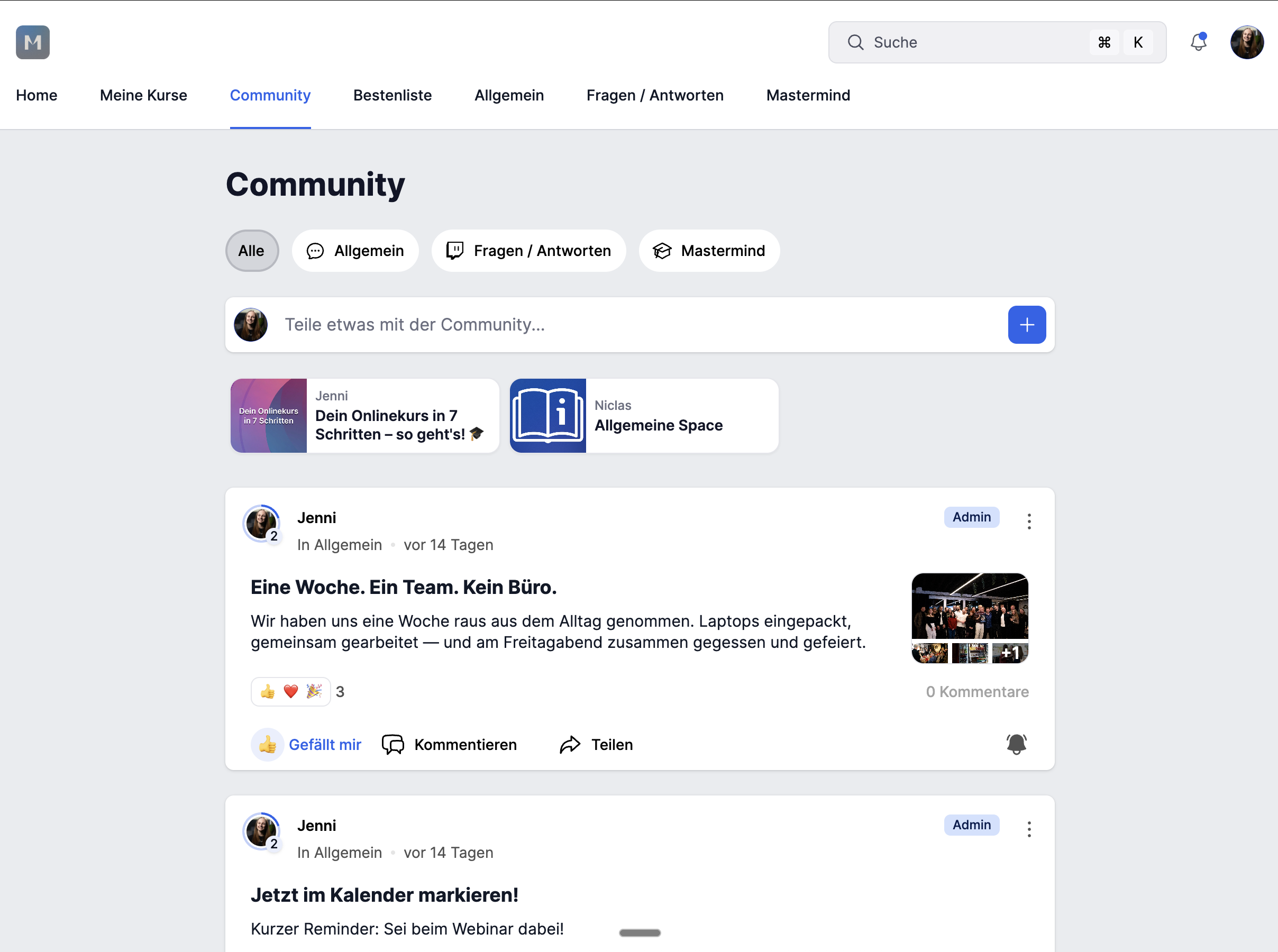
The Feed Takes Center Stage
Everything in a centered column, without a sidebar. Clean, focused, fast. Ideal when the feed is the main focus and you don’t want anything to distract you. You can choose between full view and compact view—the pinned post carousel is also active.
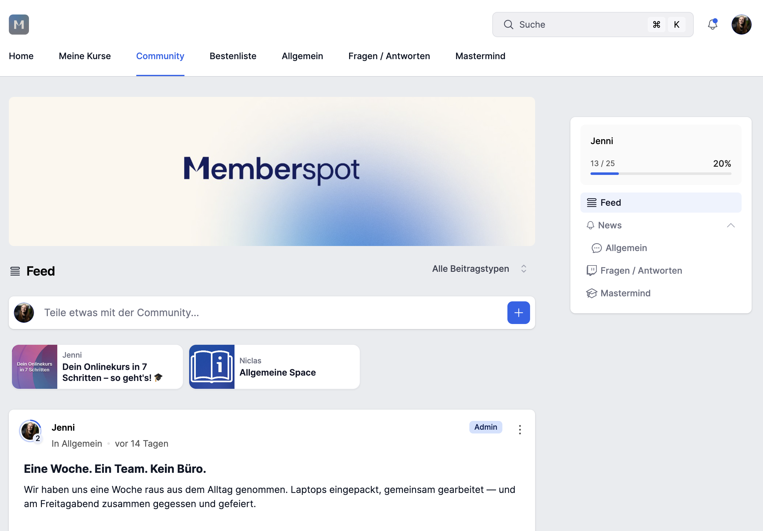
More structure, better overview
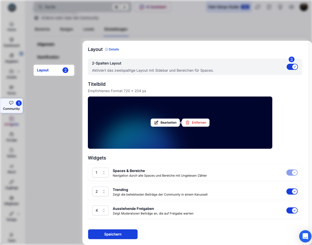
Addsa 320px-wide sidebar on the right—featuring a Trending Posts widget, Space navigation, unread counters, and gamification progress. It also includes a cover image as a banner at the top and sections to group Spaces by theme. Wider, more structured, and more at a glance.
The sidebar stays visible while scrolling—members never lose track of what's going on.
Many spaces, no chaos — that's what sections do
If you have a lot of spaces, you know the problem: the list gets long, and it becomes hard to navigate. Sections solve that.
You can organize Spaces into themed groups—each with its own name and icon. "Course Content," "Discussions," "Announcements"—whatever works best for your community. You can move Spaces between sections using drag-and-drop.
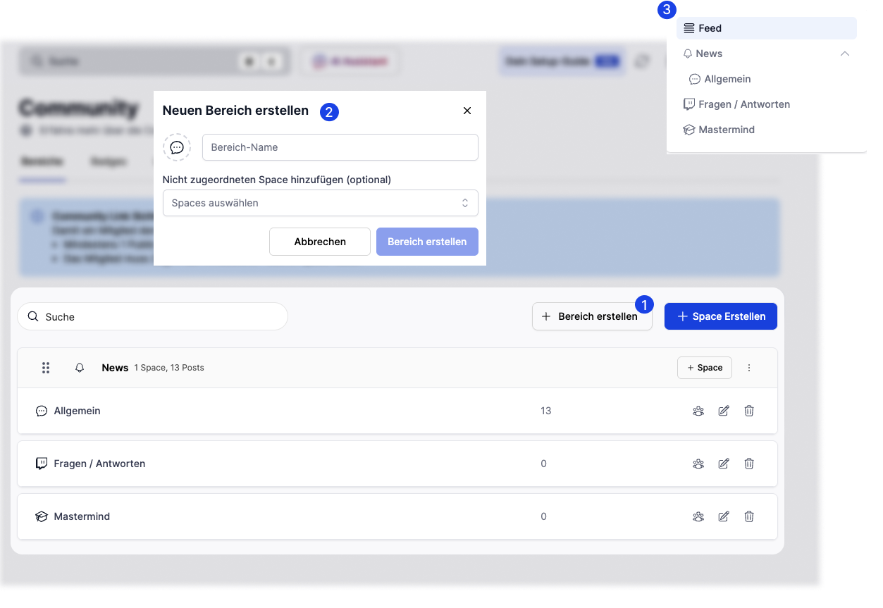
Sections are only available in a two-column layout.
Set up in just a few clicks
Admin → Community → Settings → Layout → Enable 2-column layout → Save.
When you switch back to the single-column layout, the cover image is retained—it is simply hidden, not deleted. For more information, see the help article.
Which layout is right for whom?
Coach with a Growing CommunityYouhave 5 Spaces—course content, live calls, discussion, Q&A, and announcements. As the list grows longer, navigation becomes more confusing. With the two-column layout, you can group the Spaces into sections, and the Trending Widget automatically shows what’s currently being discussed—helping new members find their way around right away.
Agency with multiple client groupsYoumanage different target groups within the same community. Sections clearly separate the different areas—“Onboarding,” “Resources,” “Client Projects.” Each group sees only what is relevant to them. The cover image sets the visual tone.
Knowledge-based companies with internal teams: You use the community for internal learning and collaboration. Few spaces, clear structure. A single-column layout is sufficient here—no overhead, no distractions; the feed takes center stage.
The differences at a glance
Smaller communities often work better with a single-column layout—less is more. If you’re growing, have more space, and need more structure: go with a two-column layout. Give it a try.


.jpg)


.webp)