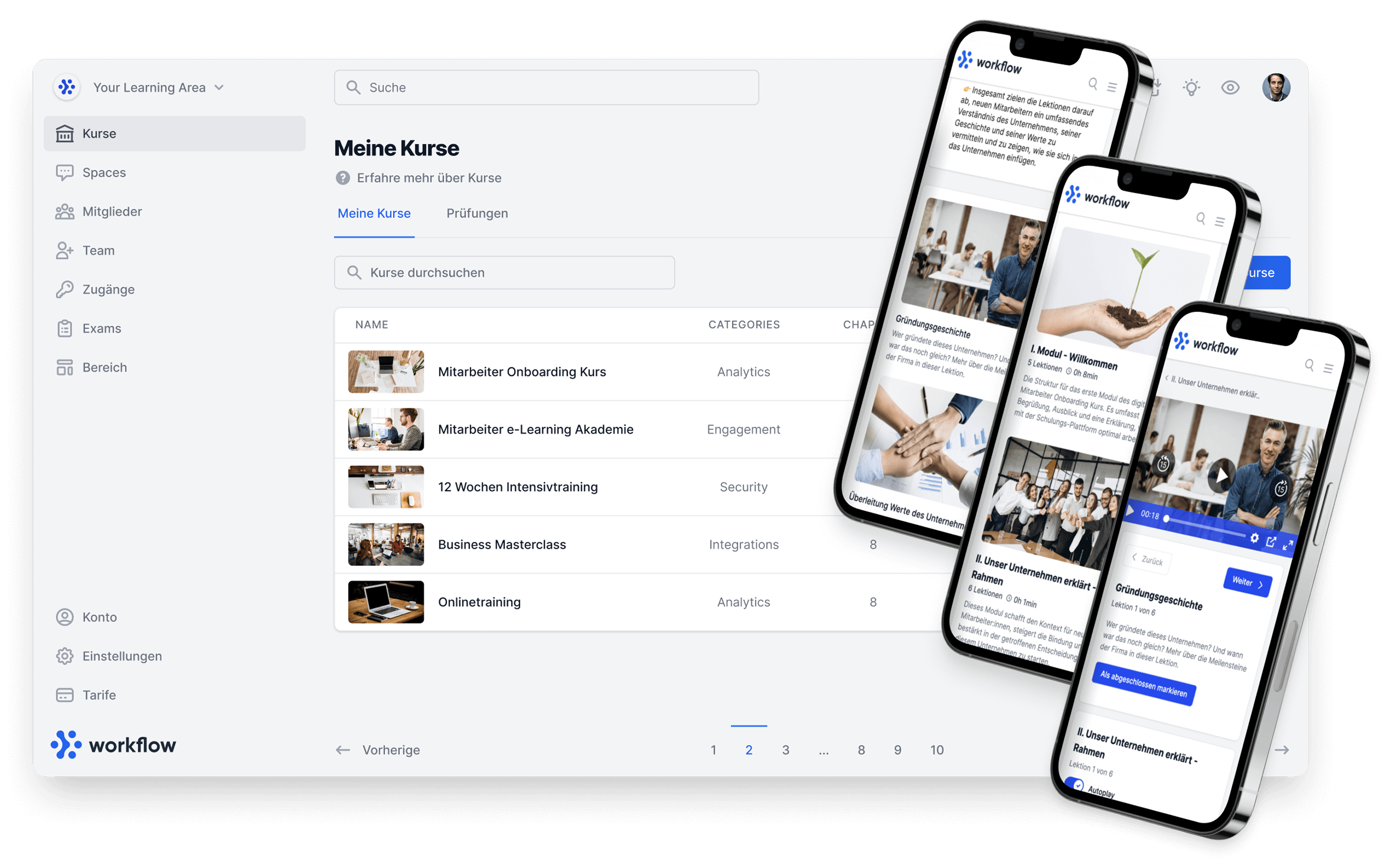
We are pleased to present the new layout for the Community. You can now decide whether you want to display your posts as a detailed or compact layout in a Space. 😌
This new function significantly improves the user-friendliness and clarity of your Spaces and brings numerous advantages. 😎
You can find out more in the latest YouTube video with Anton Kroisant, founder and CEO of Memberspot. Find out the advantages of the new layout and how to activate it. 🤓
What is the new layout feature?
The new layout gives you the flexibility to choose between two different views for your Spaces:
The classic feed view and a new, compact layout. 🤏🏽
While the classic view with a large cover image and detailed posts is still available, the compact layout offers a slimmer and clearer alternative. Here, the posts have a maximum height so that more content can be displayed on the screen at the same time. This makes it easier to scroll through quickly and improves navigation, especially with a large number of posts. 📲
Advantages of the new layout feature
🕹️ More efficient navigation:
Thanks to the reduced height of the posts in the compact layout, more content can be displayed at once. This makes it quicker to browse and provides a better overview. This is a great advantage, especially in spaces where many short updates or relevant articles are shared. 🔝
🤗 Improved user experience:
Thanks to the compact layout, the focus is directly on the content of the posts, as no cover image is displayed.
This view is ideal for spaces in which, for example, technical information or short news items are frequently shared. Clicking on the post opens it in a dialog so that the entire content is quickly and easily accessible. 🤓
🎨 Flexibility in the design:
Choose between the classic feed view and the new layout. This gives you the flexibility to design your Spaces in the best possible way. The classic feed view is suitable for visually appealing posts, such as event announcements or important updates. For interactive discussions or technical updates, however, the compact layout is ideal. 👌🏽
Use the different layouts in different contexts. A longer feed with a cover image is ideal for posts with visual elements or important news in which the cover image plays a central role. 🖼️
The compact layout, on the other hand, is ideal for posts that need to be scrolled through quickly, such as developer rounds in which relevant articles and technical information are shared. Quick scrolling and the immediate opening of posts in a dialog box enable efficient information intake. ℹ️

Do you have any other ideas?
We at Memberspot attach great importance to your feedback. If you have any suggestions or ideas for further layout options, let us know! Our goal is to continuously improve the user experience and respond to your needs. Just write directly to our support on our website! 💻
Always up to date: Inside Memberspot 💡
Stay informed about the latest updates and features with our WhatsApp channel Inside Memberspot. Subscribe to the channel and receive exclusive short videos and news directly from our team and Anton, the founder and CEO. We regularly provide you with valuable insights and tips to help you maximize the potential of your e-learning experience for your participants. 🚀
Subscribe to Inside Memberspot to stay up to date and never miss a thing! 📲
.png)
Subscribe to our WhatsApp channel now so you don't miss a thing! 💡
Conclusion: The new layout for your community
Try out the new layout feature and see for yourself how it improves your community experience. 👍🏽
Thanks for reading and see you next time! 👋🏽
Your Memberspot team 💙